Example: Graph an economics question
Updated 16 Jun 2023
The following example shows how to create a question with a supplemental graph.
- Open the Custom Question Builder and click Create New Question.
- Select Start with an empty template and click Next.
- Select the format Left/Right and click Next.
- In the Custom Question Builder, enter the following in the problem statement area:
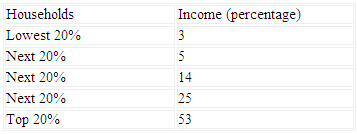
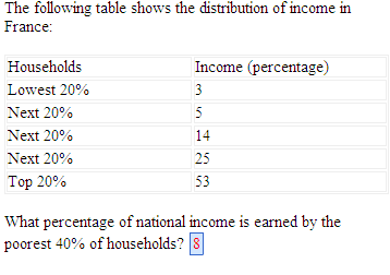
The following table shows the distribution of income in France: - Press Enter twice to move to a new line.
- Select Table > Insert Table from the top menu, and select 2 columns and 6 rows from the dropdown menus in the Edit Table window.
- Click OK to insert a table with those dimensions in your question.
- Enter the following information in the table. You can format the table later.
- On a new line, enter the following text to begin the student interaction:
What percentage of national income is earned by the poorest 40% of households? - Add one space after the text you entered and then click Short Answer in the left menu to insert an answer box in your question.
- Click Step 2: Define Answers in the Edit Answer Definition window.
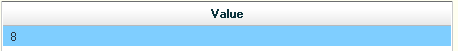
- In the value table, enter 8 as shown below:
- Click Next until you reach the last step, then click Save. The left side of your question now looks like this:
- Delete the placeholder text in the interaction area on the right and select Freehand Graph (economics courses) or Grapher (accounting, finance, OM, and engineering courses) in the left menu.
- Click Graph Settings in the window to open the graph properties window.
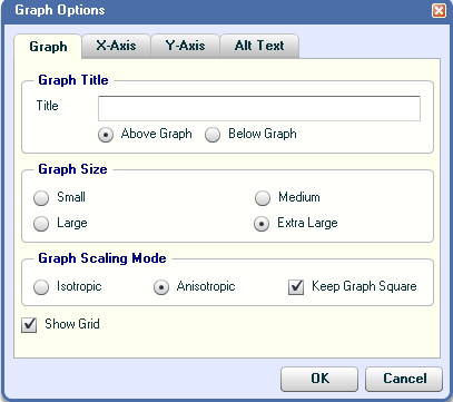
- On the Graph tab, set options as shown in the figure below:
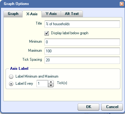
- On the X-Axis tab, set options as shown in the figure below:
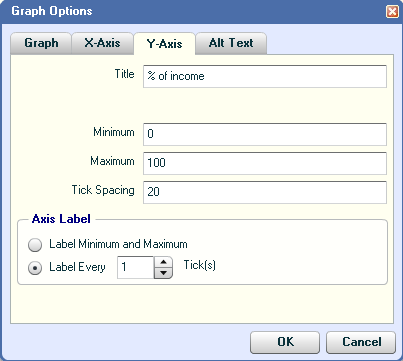
- On the Y-Axis tab, set options as shown in the figure below:
- On the Alt Text tab page, enter a brief description of the graph for students using screenreaders.
- Click OK to close the graph properties window. The graph grid now shows the settings you specified.
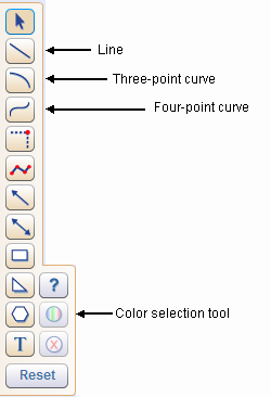
- Use the drawing tools on the palette, shown below, to draw a graph that plots the household income data:
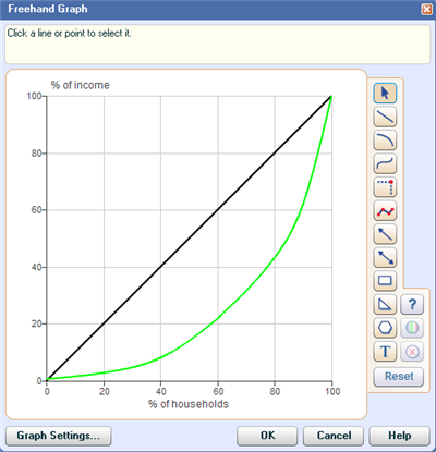
- Use the line tool to draw a line from 0,0 to 100,100
- Select the line, and use the color selection tool to change its color to black.
Click anywhere off the line to see the color change.
- Starting at 0,0, plot the first 3 income percentages using the 4-point curve tool.
As you drag the curve and plot points, notice that the coordinates are tracked in the upper right corner of the grapher window.
- Starting at the last point you just plotted, continue drawing the curve, using the 3-point curve tool to plot the remaining 2 income percentages.
- Select each curve and use the color selection tool to change their color to green.
Click anywhere off the curve to see the color change.
- Click OK to close the window. The graph that appears on the right side of your question looks like this:
- Click Preview Exercise in the formatting toolbar to see how the question displays to your students.
- When you are satisfied with your question, dismiss the Preview window and click Save.