Adding single .flv, .mp4, .aac, or .mp3 files and associated files
Use the media tag to add the following files to your items:
- Single .mp4 video files
- Single .flv animation files, including .swf files that you’ve converted to .flv
- Single .mp3 audio files, with or without images
- Single .aac audio files, with or without images
- Caption files and audio description files (.xml)
- Playlists (.xml files) of multiple files that play sequentially, typically with thumbnail images (.jpg) and titles
For animations with activities (where students interact with animations by clicking), use the flashApplet tag instead of the media tag.
You may have several files associated with one media file. For example, one animation could also have a caption file and an initial splashscreen image, or one audio file could have an image that displays during playback and an audio description file.
Use these steps to add:
- One media file (.flv, .mp4, .aac, or .mp3) to an item
-AND-
- Any associated files, such as a tt.xml caption or audio description file, or .jpg thumbnail images
To add .swf animations, first use a tool to convert them to .flv format. If you don’t have a conversion tool, you can add .swf movies with the flashApplet tag. You cannot add .swf movies with the media tag.
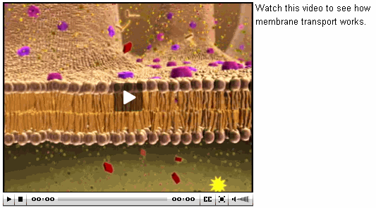
Student view
Here’s an example of what students see when an item includes a video or animation added with the media tag.
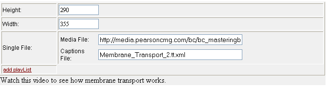
Media tag table for this example
Here’s the media tag table used to create the student view above. You can add optional text, as shown on the right in the student view, just below the media tag table. Use the float attribute to define where the text displays (see Media tag attributes for details).
Adding files with the media tag
- Upload files or copy them to a remote server.
Most caption and image files are less than 1 MB, so you can upload them to the Mastering server using the Asset Manager. Media files are often larger than 1 MB. If this is the case, you must copy them to a remote server, and include the full path to the file in the media tag table, as described below. - In the Item Editor, right-click and select Insert > media where you want the player to appear.
For the player to appear flush right in the Introduction, with text on the left, place the cursor at the start of the Introduction.
- Enter the total Height and Width (in pixels) of the player, including controls, and optional captions or descriptions.
- Click add SingleFile and for Media File enter either the file name that you uploaded as an asset, or the complete URL to the file if it’s on a remote server.
- [Optional] To add a caption file (for either audio or video), click add captions and enter the file name you uploaded.
- [Optional] Add text that displays to the right or left of the player (see text on the right in the Student view) by adding a <p> tag and text after the media table.
You can then use the float attribute to position the text. See Media tag attributes, below. - [Optional] Set any media tag attributes (below) that you want to use.
For instance, to add an image that displays while audio is playing, enter the file name (if uploaded as an asset) or URL for the image attribute.
Media tag attributes
When you click the Media File box in the media tag table, these attributes display on the left.
| height | The total height of the player, in pixels, including the controls, and optional captions or playlist. When you enter a number for Height in the media tag table, it also displays as the height attribute. Required. |
| width | The total width of the player, in pixels, including optional playlist. When you enter a number for Width in the media tag table, it also displays as the width attribute. Required. |
| align |
The position of the player on the page, similar to paragraph alignment:
|
| backcolor | The background color of the control bar and playlist, in hex (for example, #C0C0C0 for gray). The default is gray if no attribute value or skin is specified. |
| bufferlength | The number of seconds before the media starts playing. The default is 20, and Pearson recommends that you don’t change it; if you do, don’t enter a number less than 20. |
| controlbar |
The position of the control bar:
|
| float |
Positions the display and any text in the same component as the media tag (see text on the right in the Student view).
|
| frontcolor | The color of the icons and text in the control bar and playlist in hex (for example, #C0C0C0). The default is black if no attribute value or skin is specified. |
| lightcolor | The color of the icon when hovering over the controls in hex (for example, #C0C0C0). The default is white, if no attribute value or skin is specified. |
| link | A URL to an external site that displays either in the same frame or in a new browser, as defined by linktarget (below). |
| linktarget | Sets the browser frame where the URL defined by the link attribute opens. The default is _blank, which means that the URL opens in a new browser window. To open the URL in the same window, select _self. |
| mediatype | The type of media file, which determines the player presented to students. Supported types include sound, image, video, http, lighttpd, and rtmp. The default values are .flv or .mp3. If you are using any other media type, specify its extension in this field (for example, .jpg). |
| screencolor | The background color of the display, in hex (for example, #C0C0C0). For videos, this color appears before the video begins playing. The default is black. |
| skin | URL or server path to a custom .swf file to customize the look and feel of the player. |
| tags | Searchable terms you specify for the media file, similar to keywords included for web pages. |
| type | Do not use this field. |
See also: