Performance Analytics overview
Understand and improve student performance using Performance Analytics. Use the Performance Overview page to see the average for all assignments. Also see the average scores for homework, quizzes, and tests. These scores reflect the average of all the courses that you select in the Course field.
Select the links on this page to go directly to the Assignments and Student List pages. The results on these pages are based on the filters you select on the Performance Overview page. Drill deeper to learn more about individual students and assignments.
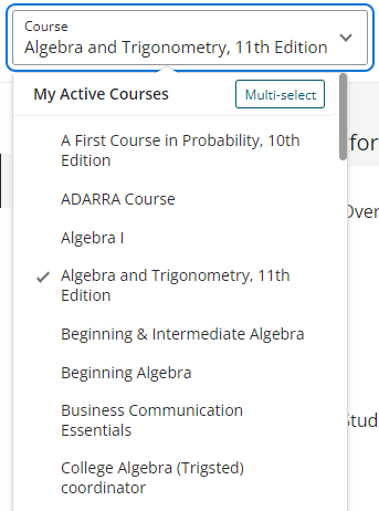
- This list shows you your active courses, your previous courses, and courses that others have shared with you.
- The most number of courses you can select is 25.
- If you make multiple selections, the course names in the Course box are replaced by the number of selected courses.
- When you apply one or more filters on the Assignments page and navigate to another page, the filters also apply to the information on the selected page.

- One course — Select to return analytics on this course.
- Multiple courses:
- Choose Multi-select.
- Select Apply to see the analytics for the selected courses.
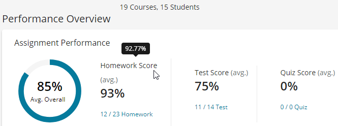
The Avg. Overall circle shows the score for all assignments (homework, tests, and quizzes) as a percentage. Hover over the highlighted section of the circle to see the percentage to the hundredths.

The boxes to the right of the circle show average scores for each assignment type (Homework Score (avg.), Test Score (avg.), and Quiz Score (avg.). Hover over a score to see the percentage to the hundredths. Each of the links below these scores tells you how many assignments are complete out of the total number. Select a link to go to the Assignments page. (Any filters you selected on the Performance Overview page are applied to the Assignments page.)
If you note discrepancies between the Average Overall percentage score and what appears in your Gradebook, see Assignments.
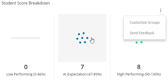
The color-coded scatterplots show how many students are performing at the following levels:
- Low Performing (red)
- At Expectation (blue)
- High Performing (green)

Select the 3-dot menu  to see the Customize Groups and Send Feedback links:
- Select Customize Groups — Drag the bars in this pop-up window to change the score ranges. Or, enter a number into each field for the group you select.
- Select Send Feedback to Pearson — Write comments in the Your Feedback field of the pop-up window.
Select the gray area in a scatterplot. (The gray area shows after you hover your cursor over the scatterplot). The Student List page opens. This page shows you all the students in the selected performance group. You see their assignments, scores, and other information. (Any filters you selected on the Performance Overview page, are applied to the Assignments page.)
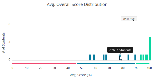
Use the Avg. Overall Score Distribution graph to see a bar graph showing student performance across all selected course(s). The Avg. Overall point (86% Avg. in the example below) specifies the point that is shown in the Avg. Overall circle.

The graph shows how many students are performing in the following levels:
- Low Performing (red)
- At Expectation (blue)
- High Performing (green)
Select a bar in the graph to see the number of students and the grade they received.
Updated 15 Sep 2025